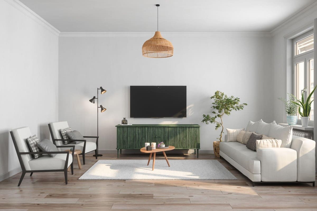
Basic colors in the interior: 4 universal shades
Basic colors in the interior. A harmonious combination of colors in the interior is one of the foundations of style. Colors allow you to control the space, solve zoning issues, affect the illumination and help to place accents. In today’s article we will talk about the most basic shades in the interior and their successful combinations.
Beige
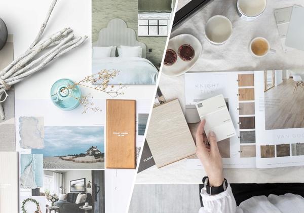
The beige interior has a certain magic of elegance and luxury. This shade is ideal for a minimalistic space filled with naturalness, as well as for complex interiors.
The main advantage of beige is its neutrality. It does not distort the perception of the room, beige can be used as a durable universal base, and the mood of the interior can be changed with the help of bright decor, textiles, furniture, etc.
According to realtors and developers, beige is the best-selling and sought-after shade in the interior. After all, it is very easy to build a fashionable eclecticism against its background and make friends with a variety of materials and prints.
Do not forget that the beige shade belongs to the warm range and gives us a feeling of comfort and warmth, sometimes too intrusive, so try to dilute it with cool tones. Blue, gray, pale lavender will do, but if you take a few cold shades, the picture will become “richer”. Not only colors, but also mirrored, glass surfaces are also able to visually “cool” the room.
Gray
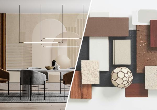
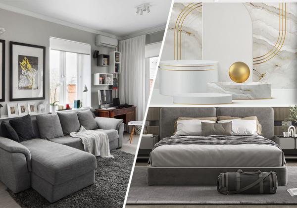
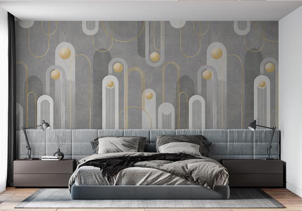
Gray is not about grayness. It is a mistake to believe that this shade contributes to the manifestation of despondency and a dreary atmosphere in the house. On the contrary, if you work correctly with its rich shade range, you can achieve a beautiful harmonious interior.
Gray color belongs to the natural palette and perfectly gets along with the cold colors of the natural range. It is suitable for people with a high speed of life, enhances intellectual activity, helps to maintain mental clarity, so gray is often used in the design of offices and offices.
By the way, a person is able to distinguish more than five hundred shades of gray. It is almost impossible to list everything. However, most of them have beautiful metaphorical names: the color of a gray glacier, a thundercloud, a silver fox, London smoke, etc.
Professional designers have long distinguished gray among the rest. First of all, for its versatility and the ability to use it to create any style in the interior, as well as for its successful compatibility with many shades. The most harmonious combinations in the interior are obtained with blue, yellow, green, ruby, creamy white.
Pink
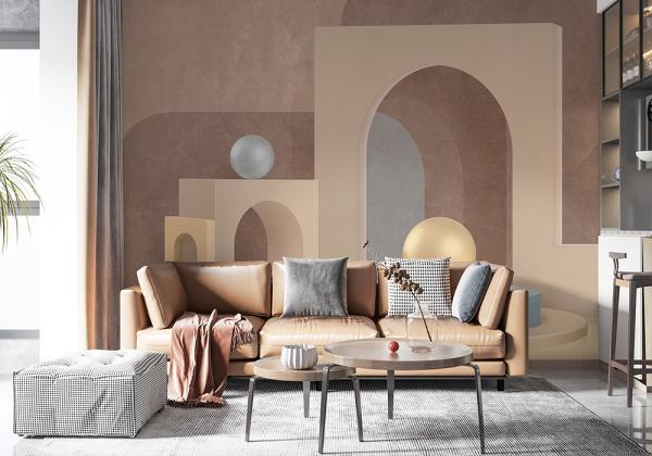
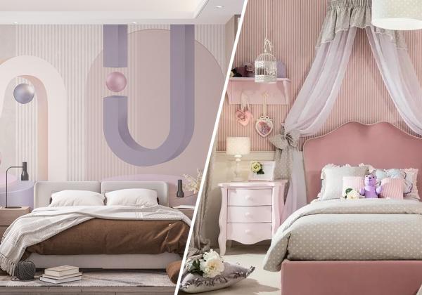
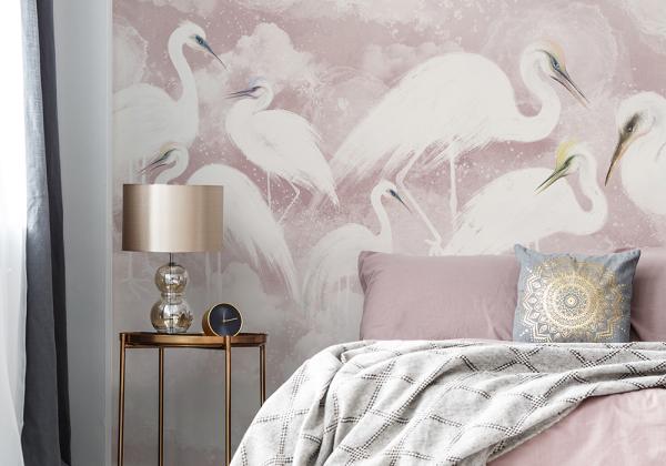
Many people used to think that charming pink is an attribute of boudoirs, girls’ bedrooms and dressing rooms. In fact, this universal color with many shades (from delicate white pastels to dark purple and purple-pink) can look gentle and elegant, and with the right tone selection will act as an original addition to a business, purely masculine environment.
Pink color can be implemented in almost any style, except perhaps high-tech or exaggerated loft. He feels especially organically in neoclassical, shabby chic, contemporary, retro, eclectic.
Psychologists say that the pink color in the interior has a beneficial effect on a person, lifts the mood and gives new strength. In such a room, you do not want to think about business and problems, the situation is conducive to rest, helps to come into balance and find peace. Therefore, the pink tone is not used in the design of offices and office spaces.
And if you feel that the world around you is too prosaic for you, by all means add fragments of a dreamy pink shade to the interior!
Blue
The blue color in the interior is the personification of natural motifs. A favorite shade of many, reminiscent of the open sky and the azure waters of the sea lagoons.
Blue-blue tones in the room eliminate nervous tension, restore peace of mind. Heavenly lightness and cool notes of shades contribute to a healthy sound sleep. In the room, the walls of which are decorated in turquoise tones, it is comfortable to be on a hot day, so the blue color is increasingly found in the design of hotels on the seashore.
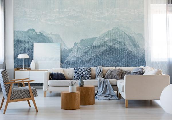
In the residential area, it is desirable to dilute the bright blue color with other tones: cream, brown, blackberry, khaki. And its combination with white is still one of the most concise tandems that will allow any interior to remain relevant for many years.

Conclusion
When it comes to interior design and renovation projects, choosing the right color palette is just one piece of the puzzle. Whether you’re planning a complete home makeover or focusing on a specific room like a bathroom renovation, partnering with a reputable remodeling company can make all the difference in achieving your desired vision.
A professional remodeling company brings expertise, creativity, and experience to the table, ensuring that every aspect of your project is executed flawlessly. When tackling a bedroom renovation, for instance, they can help you transform your sleeping space into a haven of comfort and style. From selecting the perfect color scheme to optimizing the layout and choosing the right furnishings, these experts can turn your dreams into reality.


