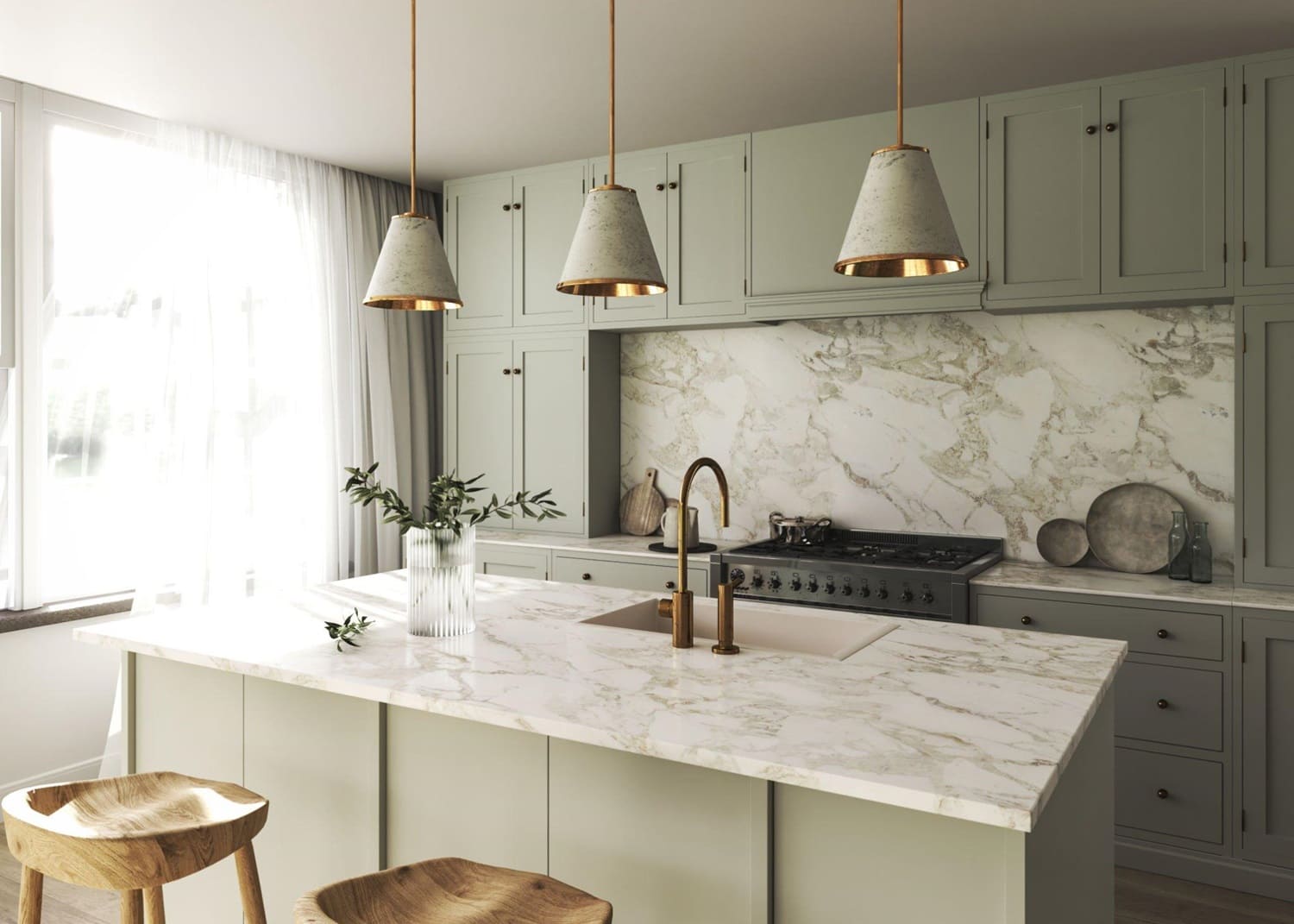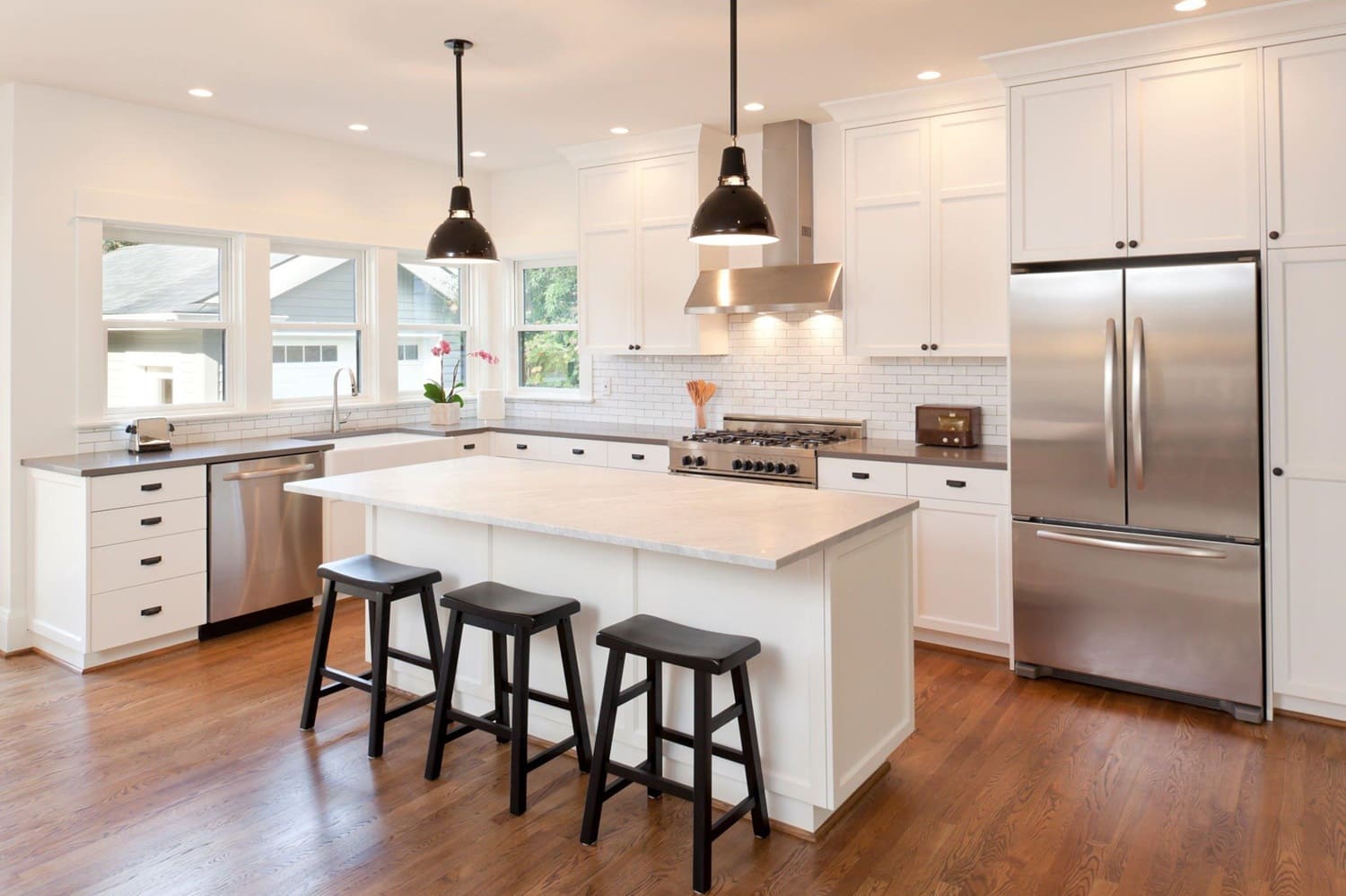
Selection of the color of the countertop for the kitchen
After you have decided on the material from which your countertop will be made, another equally important question arises – what color will it be?
Given the variety of interior styles and possible kitchen design options, the choice is not easy.
For the convenience of selecting the most suitable color, we will provide a number of photos with ready-made countertops. The gallery of the article is divided into small subsections depending on the type of material. You can ask the designer a question in the comments to this article.
General recommendations:
- First of all, you should choose the material of the countertop;
- At the time of choosing the countertop, it is already necessary to understand what color the kitchen itself will be, as well as the dimensions of the sink and hob;
- As a rule, the color of the work surface is selected in contrast with the color of the furniture.
5 main tips for choosing the color of the countertop
- The most practical and versatile colors of the countertop are: white, beige, gray (any shades), with the texture of stone chips. Black countertops are considered the least practical. They are branded, scratches, streaks and damage are visible on them.
- The countertop should echo the color with other kitchen design elements: apron, baseboards, furniture, decor.
- Contrast or in one color? In most cases, designers recommend choosing the color of the countertop in contrast to the color of the headset. More details about this will be discussed below.
- A matte countertop is more practical than a glossy one (whatever color you choose). The fact is that over time, the glossy coating is erased and it becomes visible (especially on dark surfaces). When you come to the salon to look at samples of coatings, you will find that even the matte ones shine slightly and look good.
- Do not choose bright surfaces of the following colors: blue, purple, red, orange, pink, tilt, turquoise, yellow. Not only will it be difficult to “fit” such a countertop into the interior, but it will also annoy you (sooner or later).
Choosing a countertop to match the color of the headset
As mentioned above, a contrasting color scheme of the countertop and the kitchen itself is considered more preferable. Here are some examples of the most successful combinations:
| Headset Color | Table top color |
| White (cold palette). | Almost any color, but best of all something contrasting or “under the tree”. |
| White (warm palette), beige, light sand. | Dark/light wood, brown, granite chips (not black), terracotta, dark ochre. |
| Olive, pistachio, light green. | Brown, wenge, dark woods, ochre, beige. |
| Red, burgundy, garnet. | Light or dark gray, dark texture of the stone. |
| White top/black bottom. | White, light mosaic or stone chips. |
| Grey, wet asphalt, ashy. | White or gray is darker than the color of the facades. |
You can ask the question which color of the countertop is best suited for your specific situation in the comments to this article.
Now let’s talk about what color solutions will be available when you come to order the countertop
Artificial stone textures
As you know, at the moment there are two main types – acrylic and agglomerate. Earlier we have already talked about the results of comparing countertops made of artificial stone.
In short, the first ones are good because you can make surfaces of almost any shape from acrylic. Agglomerate, also known as quartz, is more reliable and has excellent resistance to acids, dyes and high temperatures.
Compared to the previous view, these work surfaces have a range of possible colors and patterns already. Unsurprisingly, the predominant pattern in this case is stone chips of different fractions against a background of different tones.
By itself, the palette in this segment of countertops is quite wide. Believe me, there is a lot to choose from.
The rigor of natural stone
Such countertops are distinguished by their super durability and strength. It’s not scary to put a hot pot on them or spill coffee. Of course, such quality has its price, sometimes very, very high.
Here the range of color possibilities is even lower. We can say that you will be able to find no more than two or three dozen real, radically different drawings.
This is due to the small number of rocks of stone and their varieties, which can be used as a material for countertops in the kitchen.
The most common texture is red and gray granite.
Natural marble looks very reliable and solid.
Wood Textures
This is an exquisite and relatively inexpensive version of countertops for the kitchen.
Color solutions in this case are limited to literally several types of wood – walnut, ash, oak, iroko. They may differ in tones, textures, “knotty”, width of wood beams or array.
Such countertops can be found in Scandinavian-style kitchens.
Dark wood surfaces look good with light furniture. Once again, you can see that the rule of selecting the color of the countertop in contrast to the color of the headset is a very interesting solution.
Remember that the tree requires constant care and careful attitude.
In any case, when choosing the color of the kitchen countertop, it is highly desirable to see how it looks live (in the salon or with friends, if we are talking about a recommendation from their side).
This will help you look at the picture “as a whole” and choose not just a beautiful countertop, but also a practical one, as well as suitable for your set and kitchen interior.
In conclusion, the countertop is a central component of any kitchen remodeling project. It’s where aesthetics, functionality, and durability intersect. To make the best choice for your kitchen, collaborate closely with a reputable remodeling company. They have the expertise to guide you through the material selection process, ensuring that your kitchen countertop meets your needs and enhances the overall appeal of your home.


